
Intro
01 | overview
02 | research
03 | Development
04 | building framework
05 | final solution

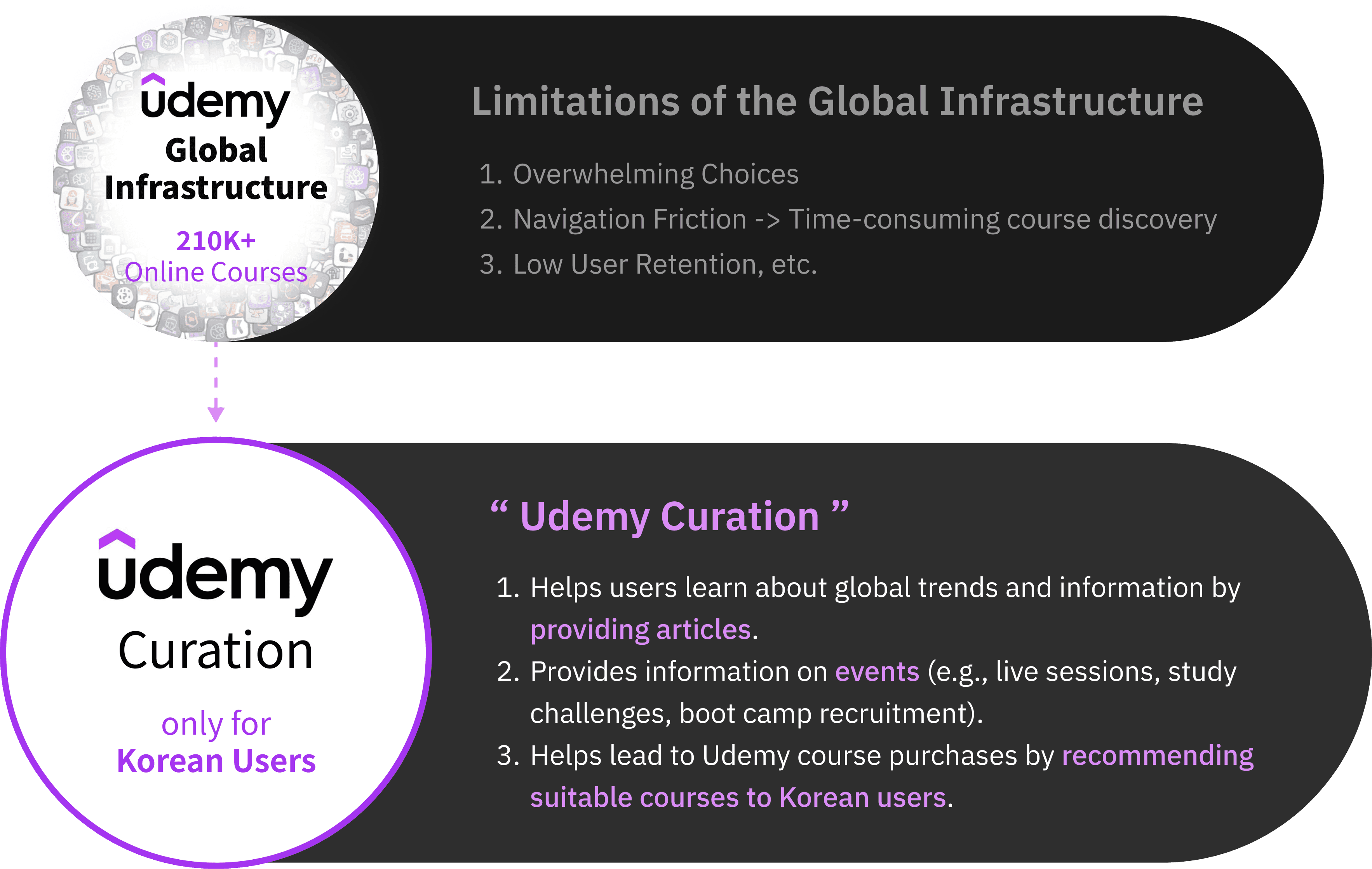
Curation
Digital Cognitive Health Assessment and Training Platform
Udemy Curation Mobile Redesign is a UX/UI project focused on optimizing the personalization experience within a B2C learning platform. While my current research centers on bio-signal-based systems, this project was pivotal in shaping my understanding of designing interfaces for personalized recommendation systems. The goal was to resolve navigation friction and enhance user engagement by restructuring the information architecture and introducing interest-based learning roadmaps.
As a UI/UX Designer, I analyzed user behavioral patterns through surveys and usability testing to identify disconnects between the curation service and the global platform. I designed a logic-driven interface that seamlessly connects users with AI-curated content and customized pathways based on their stated interests. This experience of translating user data into intuitive interface mechanisms serves as a practical foundation for my advanced research into hyper-personalized, AI-driven wellness systems.
MY ROLE
UX/UI Designer
Skills
Information Architecture
User research & testing
Wireframing & prototyping
User Interface Design
Team
Passion Project
Timeline
January 2024
01 | overview
Key highlights
Fragmented navigation, unclear differentiation between curated and global content, and heavy reliance on manual comparison create cognitive overload while learners search for, compare, and select courses.
This friction is more pronounced in contexts where learners expect clearer guidance, structured pathways, and faster comparison when selecting learning content.
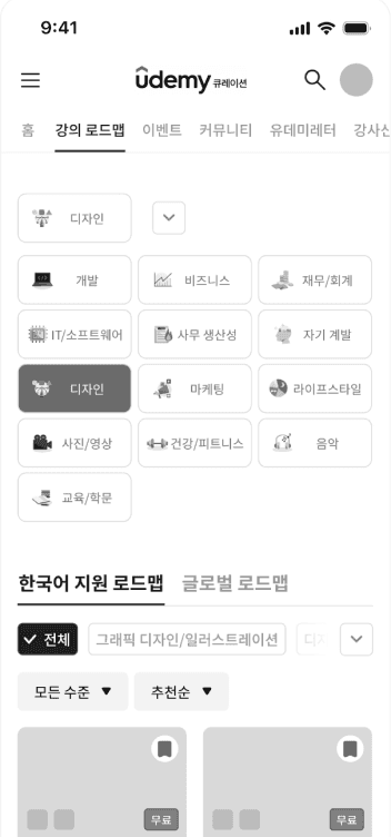
Localized Information Architecture
Content Structure Based on Local Context
The layout and information hierarchy are restructured to reflect region-specific browsing and decision patterns, allowing users to recognize relevant content more quickly and navigate with less cognitive effort.
Personalized Curation
Tailored Learning Roadmap
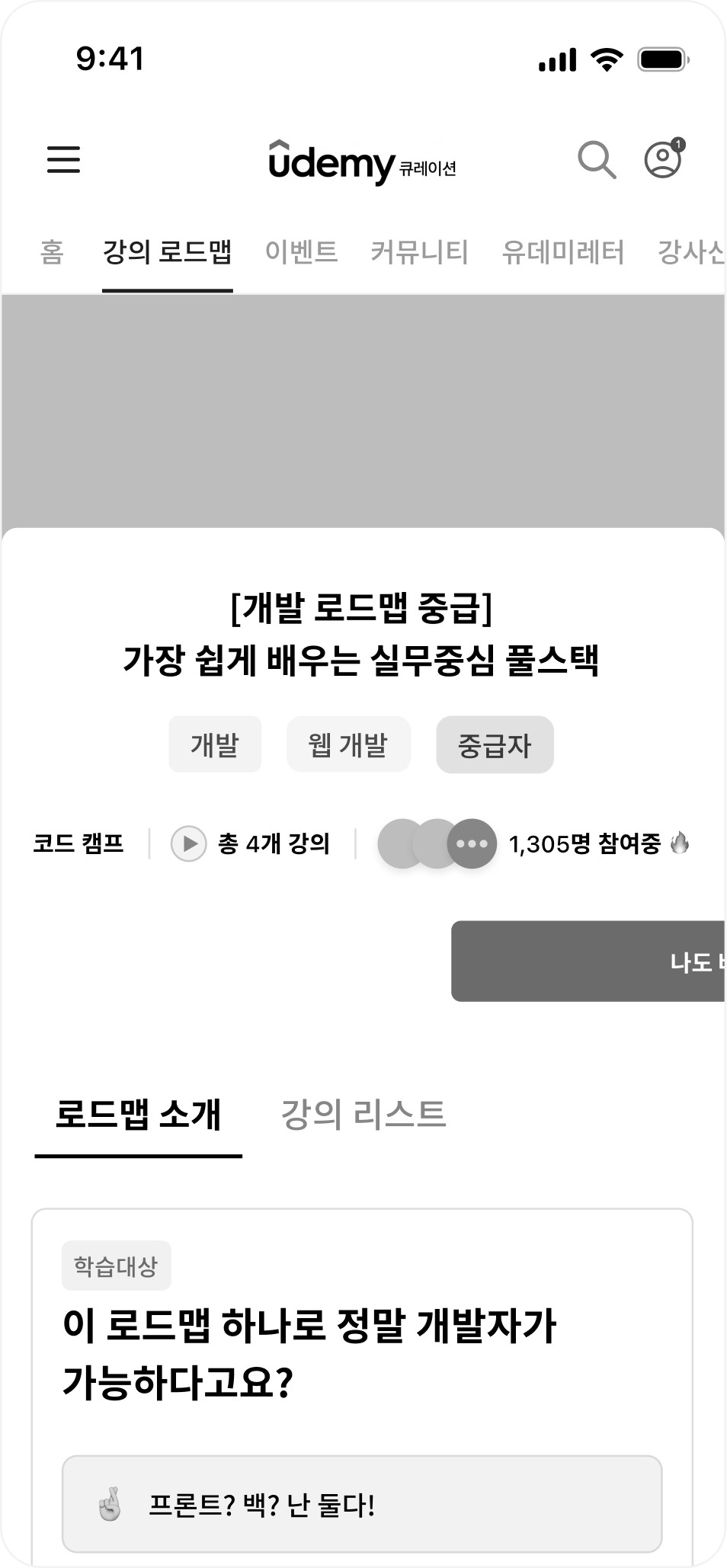
A personalized learning roadmap organizes courses into a clear progression based on user goals and skill level, helping users understand where to start and what to take next without manually assembling a path.
Navigation Efficiency
Short-Path Architecture
A short-path navigation structure surfaces key categories and search entry points upfront, minimizing the number of steps required to move from discovery to enrollment.
Decision Support
Intuitive Decision Support
A comparison-driven decision support system visualizes key course attributes—such as relevance, price, and ratings—so users can evaluate options quickly and commit with confidence.
02 | research
problem space
As learning platforms scale, course selection has become increasingly complex. Learners are required to search, compare, and evaluate multiple options independently, making confident decision-making difficult.
Within Udemy Curation, this challenge persisted despite the intent to simplify discovery through localization. Users struggled to distinguish curated content from the global catalog and frequently relied on repeated comparison and back-and-forth navigation before committing to a course.
These patterns revealed a core issue: learners could find courses, but lacked structural support to efficiently evaluate options and commit with confidence.
These challenges spanned service strategy, interaction design, and interface structure, informing the design goals outlined below.
Problem
goal

Users were able to discover courses, but struggled to confidently evaluate options and commit without excessive comparison. The challenge was not the lack of content or features, but how fragmented strategy, interaction, and interface decisions failed to support decision-making as a cohesive experience.
This led to a central question:
💭 How might Udemy Curation be designed as a cohesive experience that helps users quickly understand its value, evaluate courses with confidence, and commit without excessive comparison?
research methodology
To understand user needs and decision friction, I analyzed the existing service flow, surveyed users, and reviewed comparable platforms.
Existing Service Analysis
Mapped the end-to-end user journey to identify friction points, including hidden search access and fragmented navigation.
User Survey
Surveyed 43 users, revealing difficulty comparing courses and navigating complex flows as key barriers to enrollment.
Competitive Analysis
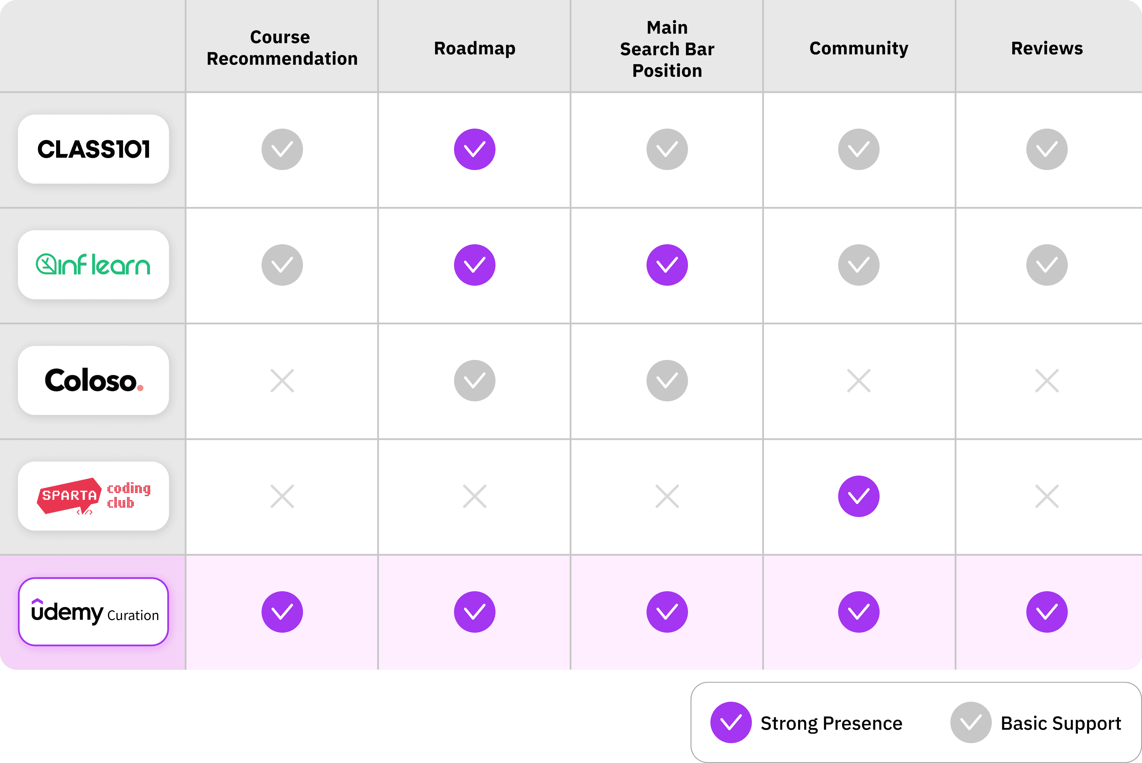
Benchmarked 4 competitors to identify differentiation opportunities around structured roadmaps and community-driven learning.
research highlights
existing service analysis highlights
To understand where users drop off during workflow, I mapped out end-to-end journey of using Udemy from entry to course purchase. This revealed recurring friction points and misalignments within the existing flow.
Coming in
High cognitive load at entry due to hidden navigation and unfamiliar terminology.
Exploration & Evaluation
Difficulty in discovering and evaluating courses caused by poor categorization and lack of summarized insights.
Action & Departure
Cumulative navigation fatigue resulting from unexpected redirections and broken user flows.
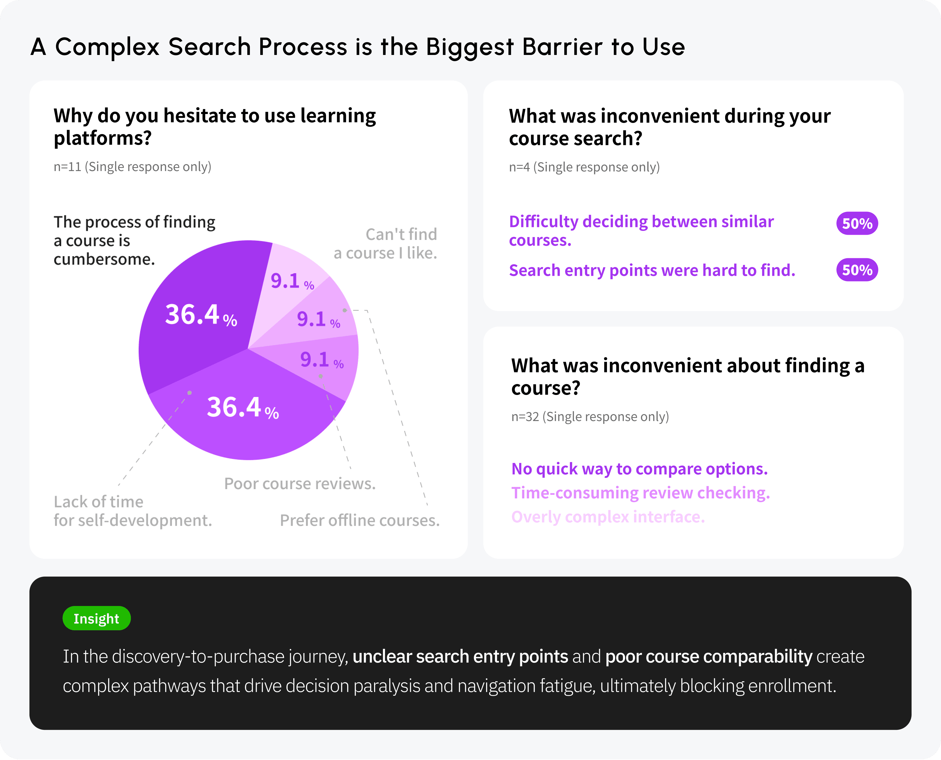
user survey highlights
To validate early usability findings, I conducted a survey with 43 users to understand where friction occurred during course search and evaluation. The survey focused on barriers that prevented users from confidently selecting and enrolling in courses.
The data revealed that "decision paralysis due to difficulty in comparing courses" and "navigation fatigue from complex pathways" were the primary barriers preventing users from enrolling in classes.

Competitive Analysis Highlights
To understand how leading platforms support course discovery and decision-making, I analyzed several market competitors. This analysis highlighted gaps in guidance, social interaction, and search visibility within Udemy Curation, while revealing patterns in how competitors structure learning paths, community engagement, and search access.
I turned user frustrations into clear design goals. By listening to their struggles with searching and choosing courses, I defined exactly what needed to be fixed to make their experience smoother.
Pain point
The process of finding a course is cumbersome.
Udemy Curation uses non-intuitive language.
Difficulty comparing similar courses.
Needs
Streamline the course discovery path.
Need to use intuitive language.
Simple, at-a-glance course comparison.
03 | development
Project Direction
To address the key sources of user friction identified through research, I defined the project’s design direction around enabling faster, clearer, and more confident decision-making.
The overall direction focused on simplifying information hierarchy, supporting personalized learning paths, and reducing unnecessary navigation steps—forming the foundation for all subsequent design decisions.
“ Efficient, short-path personalized curation ”
Clear information hierarchy for quick understanding and next steps.
Intuitiveness
Personalized learning paths aligned to goals and experience levels.
User Optimization
Short Path
Fewer navigation steps to reach relevant courses with minimal effort.
persona
To ground design decisions in real user behavior, I defined two personas representing first-time and returning users. These personas surfaced different forms of friction during course discovery and evaluation.
Persona A

Yoon Si-woo
(22, College student)
Confusion Between Curation and the Global Platform
A new user who is visiting for the first time and is exploring
"I visited Udemy Curation for the first time, filtered classes by category, then clicked 'See all reviews'—a Udemy.com link opened right away,
and I was confused."
Visit frequency
Loyalty
Search behavior
High
Low
Course recommendation
Direct exploring
Low
High
Persona A’s Needs
Users need intuitive navigation with clear terminology, quick course discovery and comparison during exploration, and a seamless end-to-end flow to action without redirects.
Yoon Su-min
(27, Office worker)

I use Udemy Curation a lot!
A user who often visits class platforms
"User often comes for global classes with Korean support and Udemy Curation events, but if there’s no new job-related class and no event they leave, and sometimes visits just to check a saved class name."
Persona B
Visit frequency
Loyalty
Search behavior
High
Low
Course recommendation
Direct exploring
Low
High
Persona B’s Needs
Users need direct access to saved classes and events when coming in, quick discovery of new job-related updates during exploration and evaluation, and a seamless flow for managing saved items through action and departure.
journey map
Applying the personas to the end-to-end journey revealed two major breakdowns: friction during course discovery and confusion caused by abrupt transitions to Udemy.com. These moments consistently triggered frustration and drop-off.
Understand what Udemy Curation is before engaging with content
Search directly from the home screen
Receive clear context before transitioning to Udemy.com
Move between platforms with minimal disruption
Compare saved courses using consistent criteria
Want to understand the service right away.
Want to get a notice before moving from Udemy Curation to Udemy.com.
Want to move between the two sites in fewer steps.
Initial Entry & Context
Course Discovery
Course Evaluation
Platform Transition
No visible search entry point → forces category-based browsing
(For new users) Sometimes the first-time sign-up event did not show.
Comparison requires manual tab switching → increases cognitive load
Ambiguous terminology
→ slows decision-making
Abrupt redirection to Udemy.com → breaks mental model
Not sure if there is a setting for interest categories.
Do not know the difference between Udemy Curation and Udemy.com.
Have trouble getting back to the Udemy Curation site.
Key Friction Points Across the User Journey
mvp
Body
MVP List
04 | building framework
flow chart
Based on the initial framework developed for the project, I structured the flow chart to reflect its overall direction. Rather than focusing on individual features, the flow follows how different users enter the service, explore content, and move toward a course decision.
Splash & Login
(Kakao/Email)
Personalization
Onboarding
Home
Search/
Category
Course List
Search
History
Filter
Search Result
Roadmap
Select
Category
Roadmap
Detail
Community
Board List
Post View/
Write
My Page
Setting
My Wish
Course
Comparison
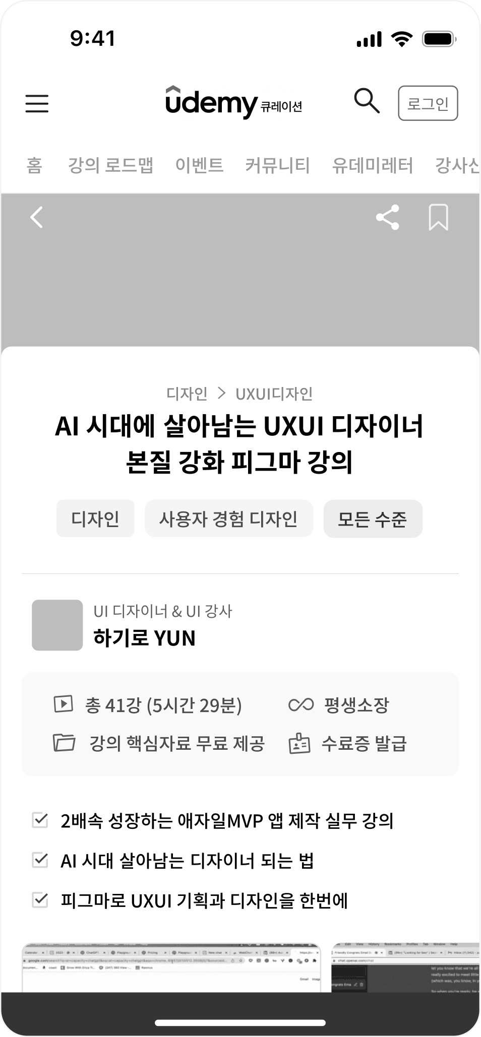
Course Detail
Go to Udemy.com
information architecture
To support the intended user flow, I reorganized the information hierarchy to clarify what should be prioritized for learners. Course Roadmap and Community were elevated to the top level to surface guidance and validation early, while secondary and non-learner features were intentionally placed deeper.

sketching
Body
Sketching
wireframe
As a next step, I translated the user flow and information architecture into wireframes to validate the clarity and logic of key paths before visual design.
Personalization
Onboarding
History
Filter

Search Result
Filter
Search
Menu
Home
Category
Roadmap Info
Course Info
Roadmap
Community
Compare
Saved Courses
My Page
My Page
Home
Personalization
Onboarding
Search
Roadmap
Community
usability test
After establishing the structural skeleton of the solution, I conducted usability testing on the wireframes to identify remaining points of confusion before visual design.
The feedback revealed issues related to visibility, affordance, and system feedback, which directly informed the refinements shown below.
Simplified design enabling instant course display.
Persistent FAB & confirmation popup for clear interaction.
“The button was placed next to the instructor's name, confusing users (e.g., "Am I liking the instructor or the course?").”
“Users received no clear feedback or confirmation after liking a course.”
“Category buttons within the roadmap were not easily noticeable.”
“The course list didn't load immediately after selecting a category, causing friction.”
Users’ Feedback
Solution
"Like" Button
(Course Page)
Course Roadmap
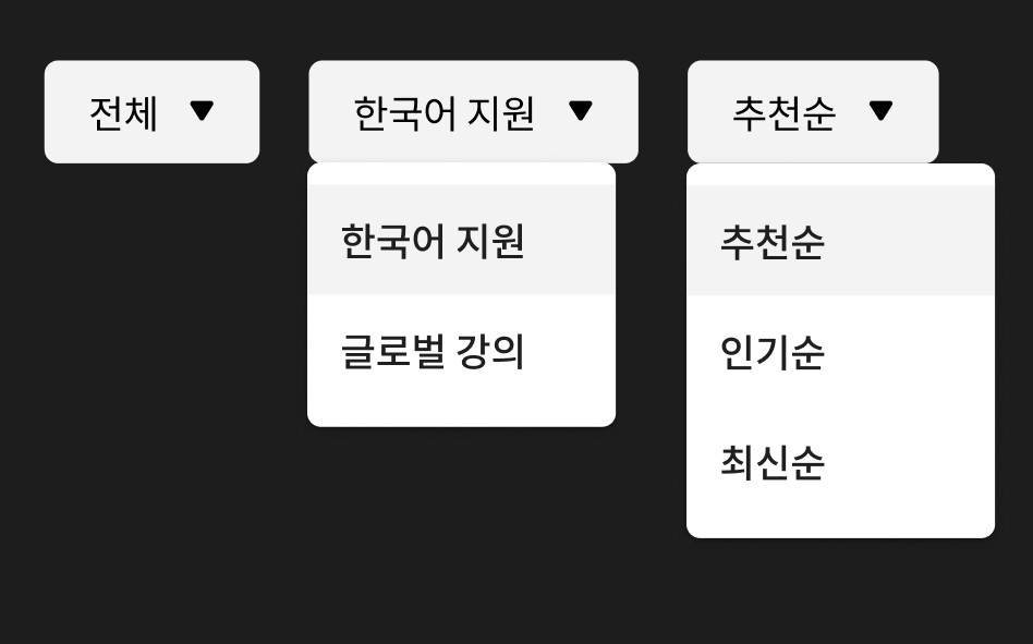
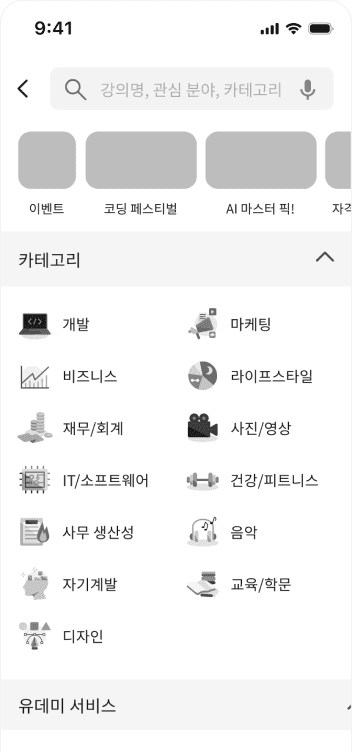
“The complete list of category filters was hidden and not visible at a glance.”
Category Filter
'All' tab & 'Expand' feature for full visibility at a glance.
05 | Final solution
Screen Specification highlights
The final screens translate the structural decisions into concrete UI solutions across four focus areas: intuitive discovery, personalization, decision efficiency, and retention.
Each screen was designed to reduce friction at key moments—helping users find relevant content quickly, compare options with confidence, and move through the experience without unnecessary interruptions.
Solution 01
Intuitive Discovery
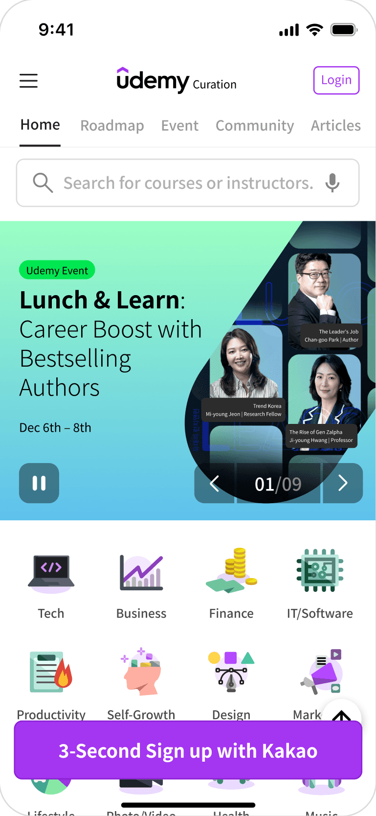
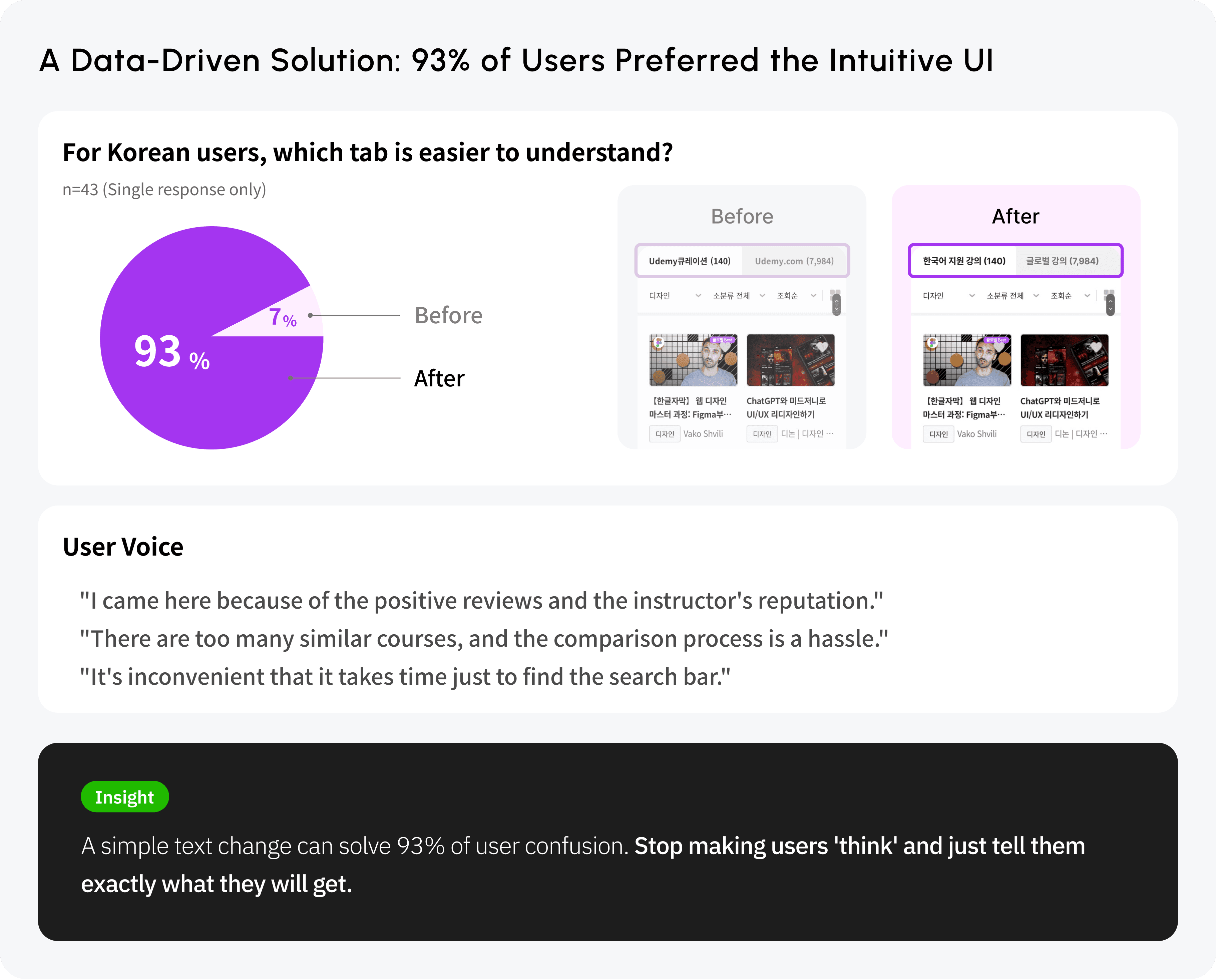
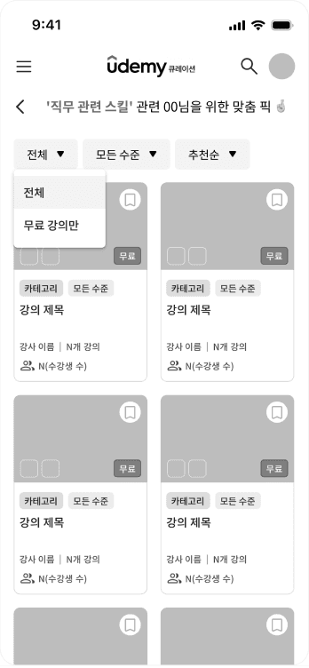
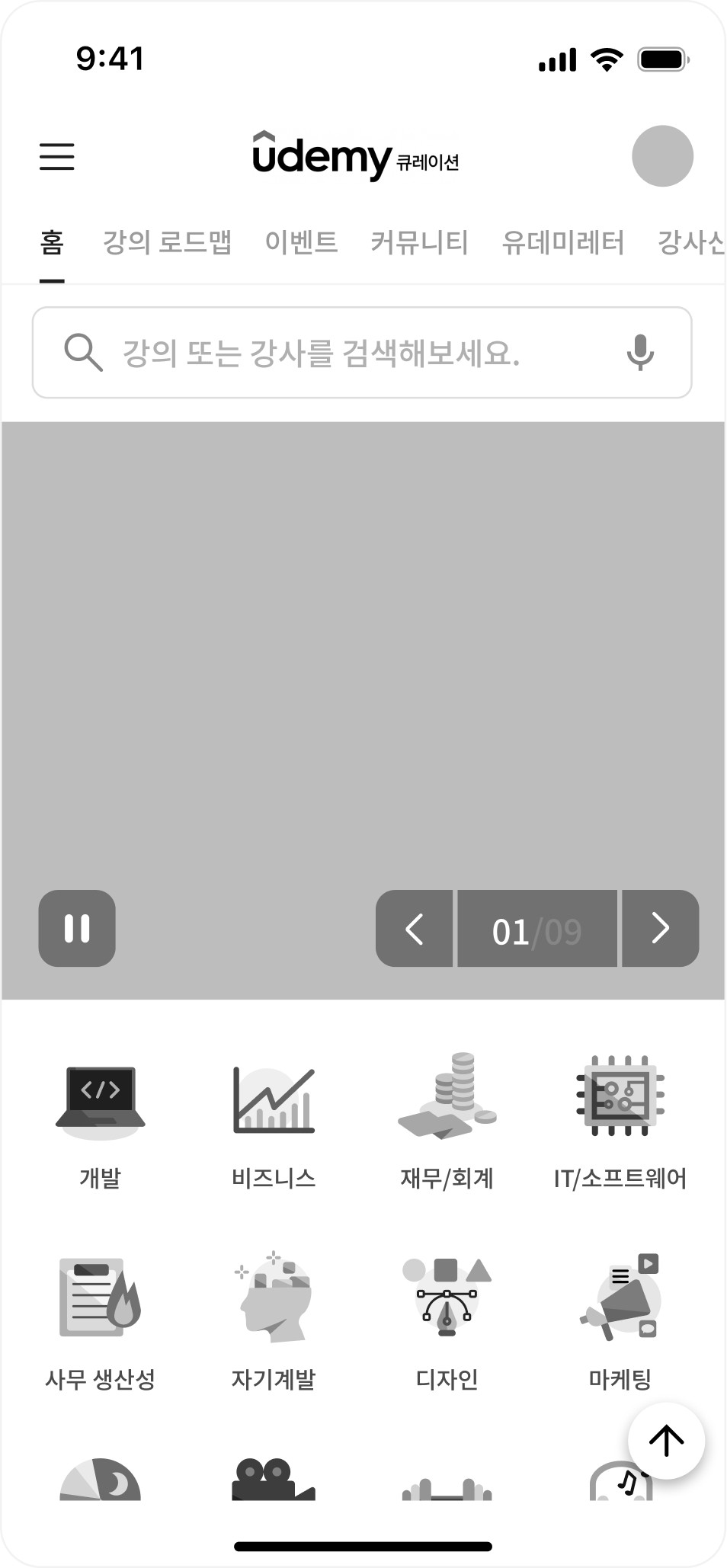
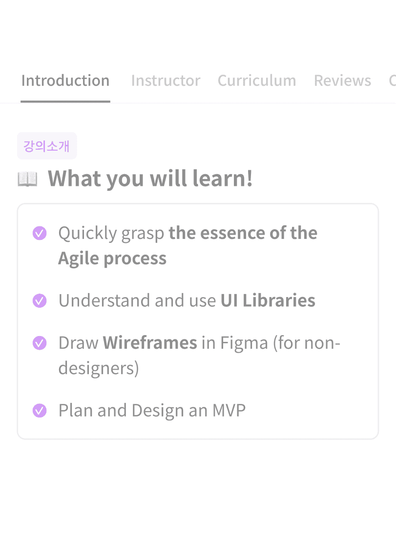
Optimized Search & Adaptive Navigation Placing the search bar and category icons at the very top minimizes the user's search path. The interface dynamically reorders category tabs based on the user’s selected interests, ensuring immediate access to the most relevant content from the moment of entry.
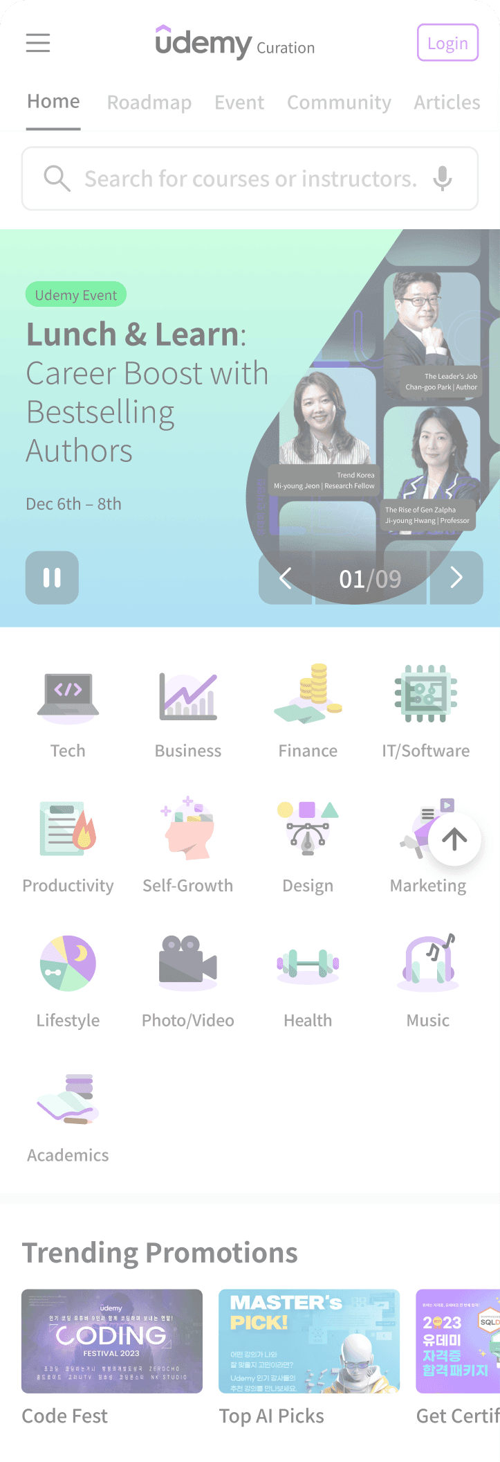
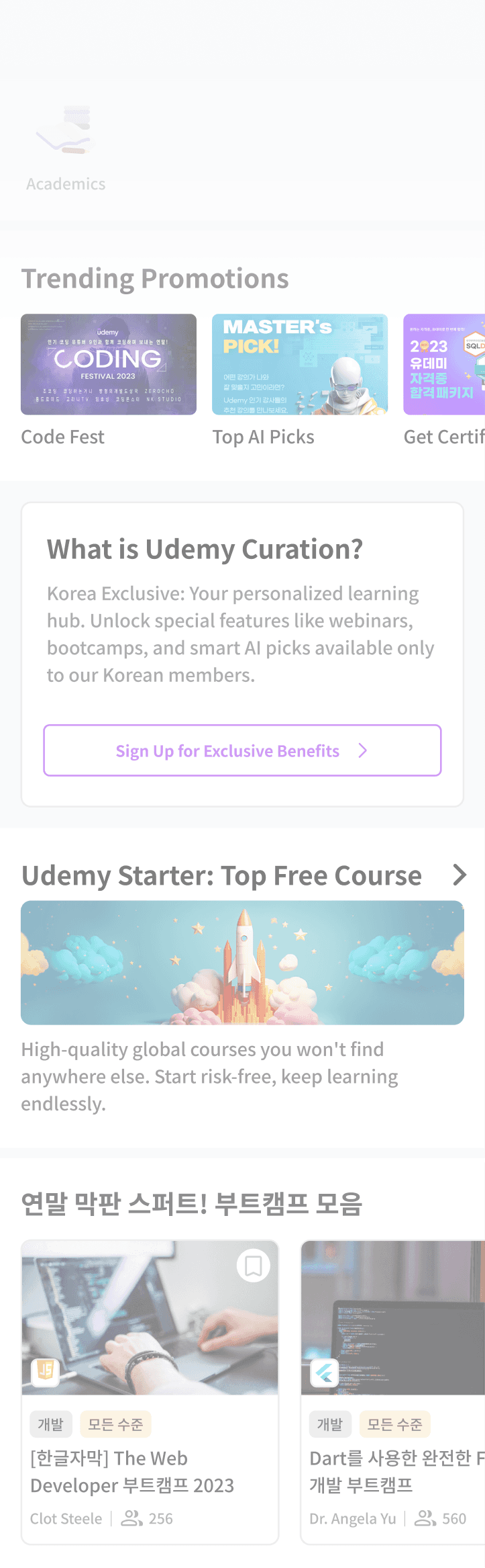
home 01
Multidimensional Search & Navigation
Positioning key navigation elements at the top minimizes search paths, ensuring immediate access to diverse content from the moment of entry.
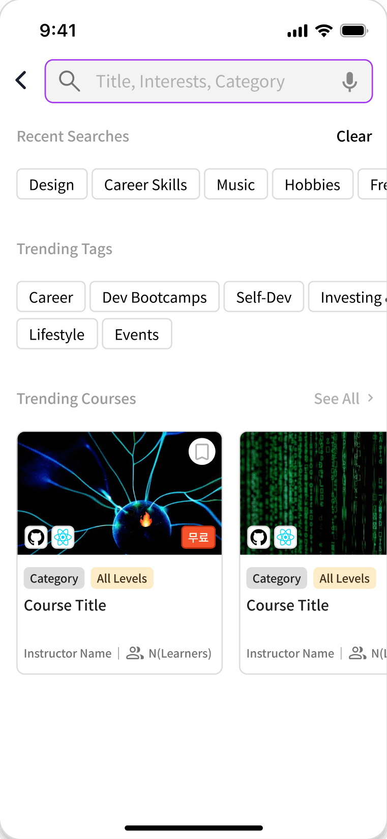
search
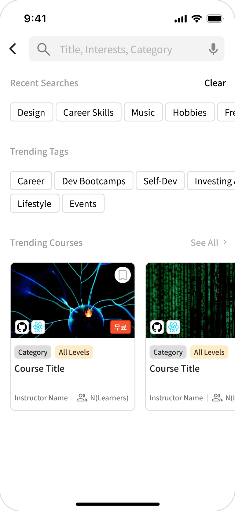
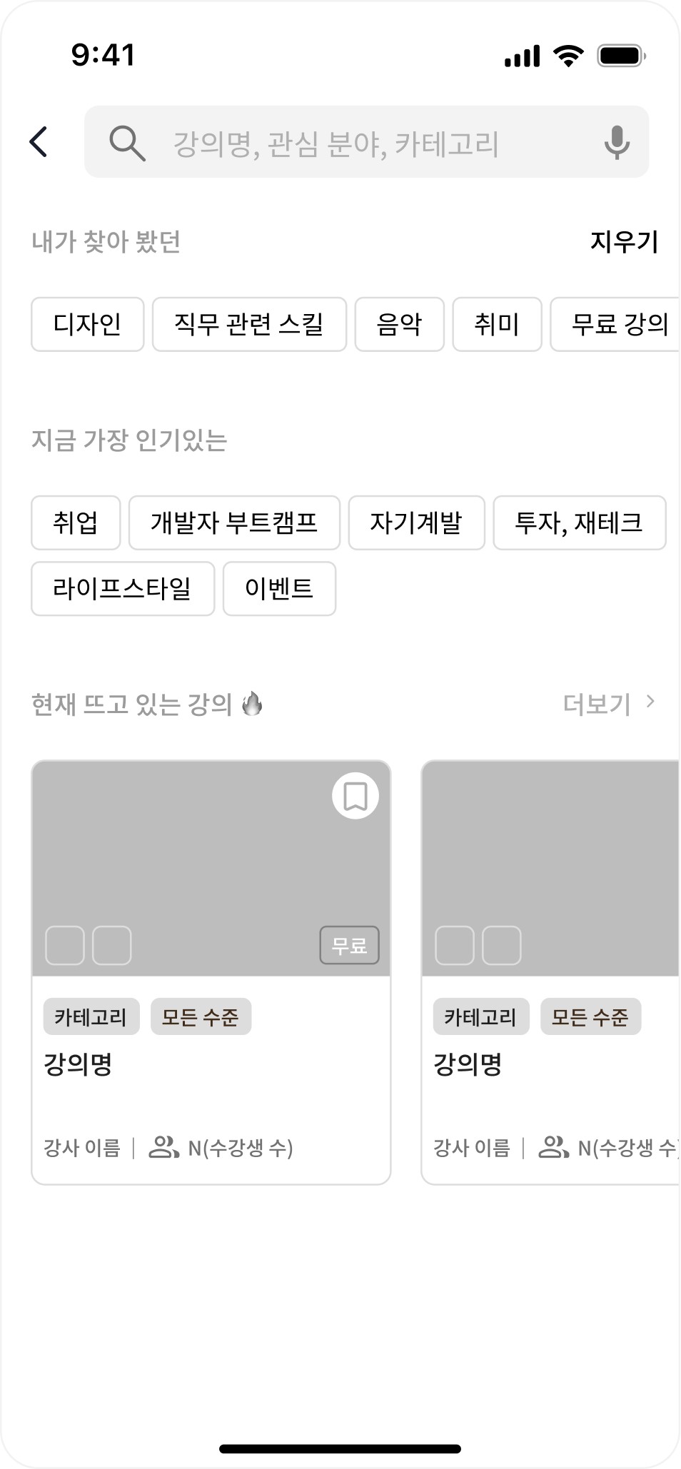
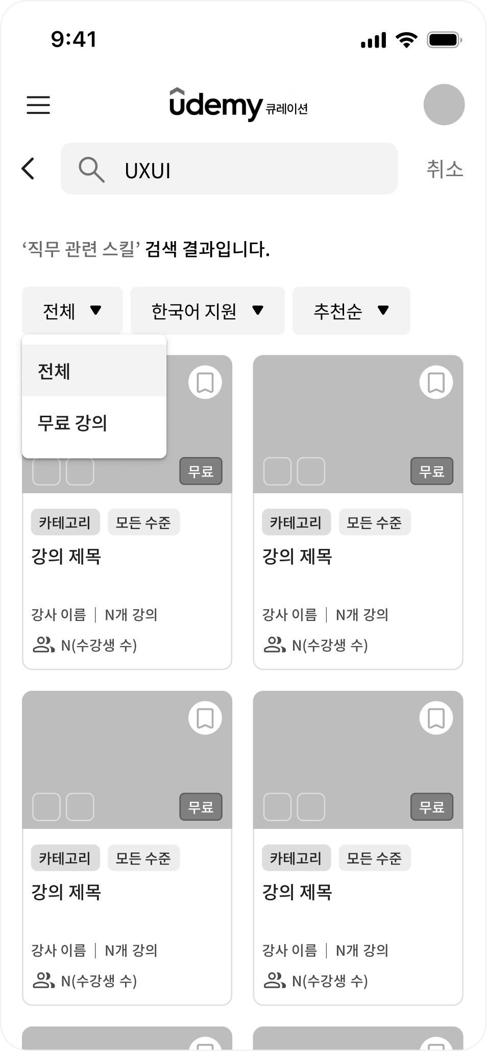
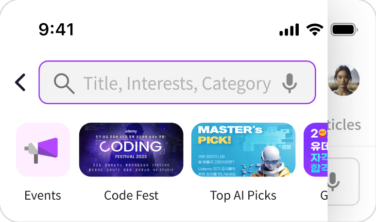
Omnipresent Smart Search System
Omnipresent Smart Search Accessible from any page, it optimizes discovery using voice input, history, and trends to deliver instant, personalized results.
home 02
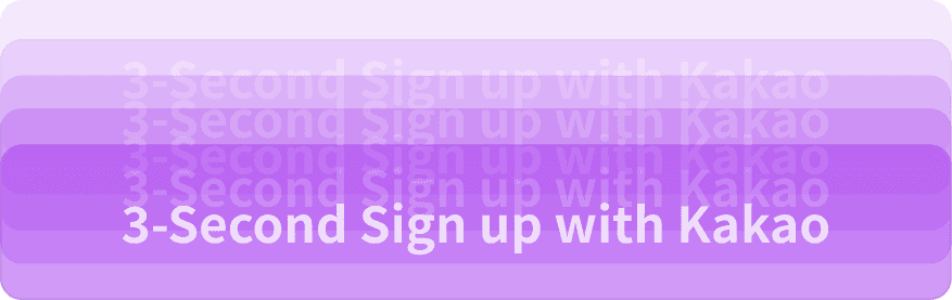
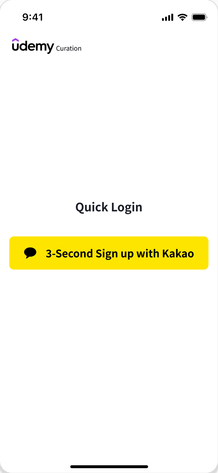
Seamless Onboarding to Conversion
Value-focused banners and a "3-Second Start" FAB lower entry barriers, effectively guiding first-time visitors from understanding to active membership.
Hamburger Menu Search Bar
Sticky Nav Search Icon


Solution 02
Hyper-Personalization
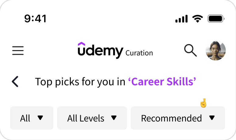
Custom Learning Roadmaps Beyond simple recommendations, this solution designs a complete learning journey. By analyzing user levels and goals, it curates specific "Roadmaps" and "Custom Picks," transforming passive browsing into active, goal-oriented learning with clear milestones.
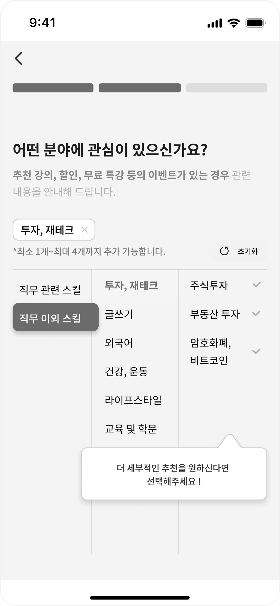
Sign-up interests applied
signup & custom pick
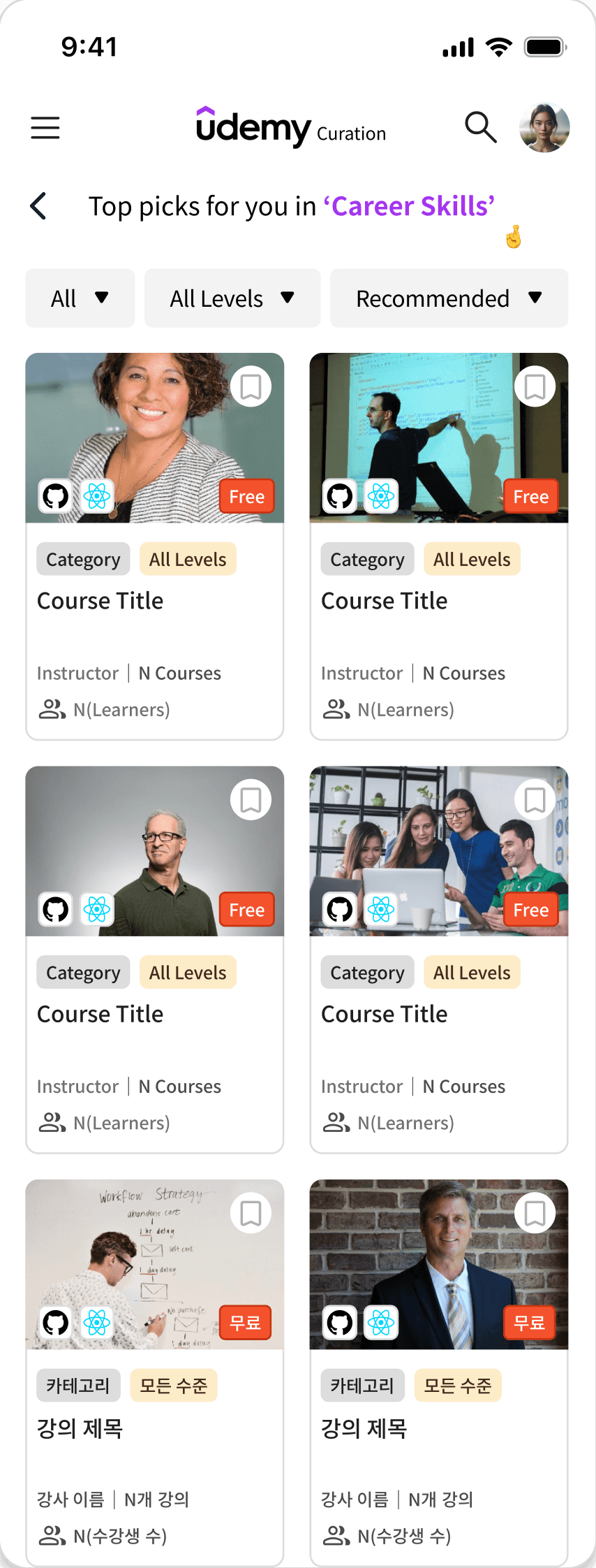
Interest-Based Precision Curation
Seamlessly translates user interests collected during onboarding into a refined "Custom Pick" list.
With advanced filters like difficulty and price, it ensures users instantly find the most relevant courses without manual searching.
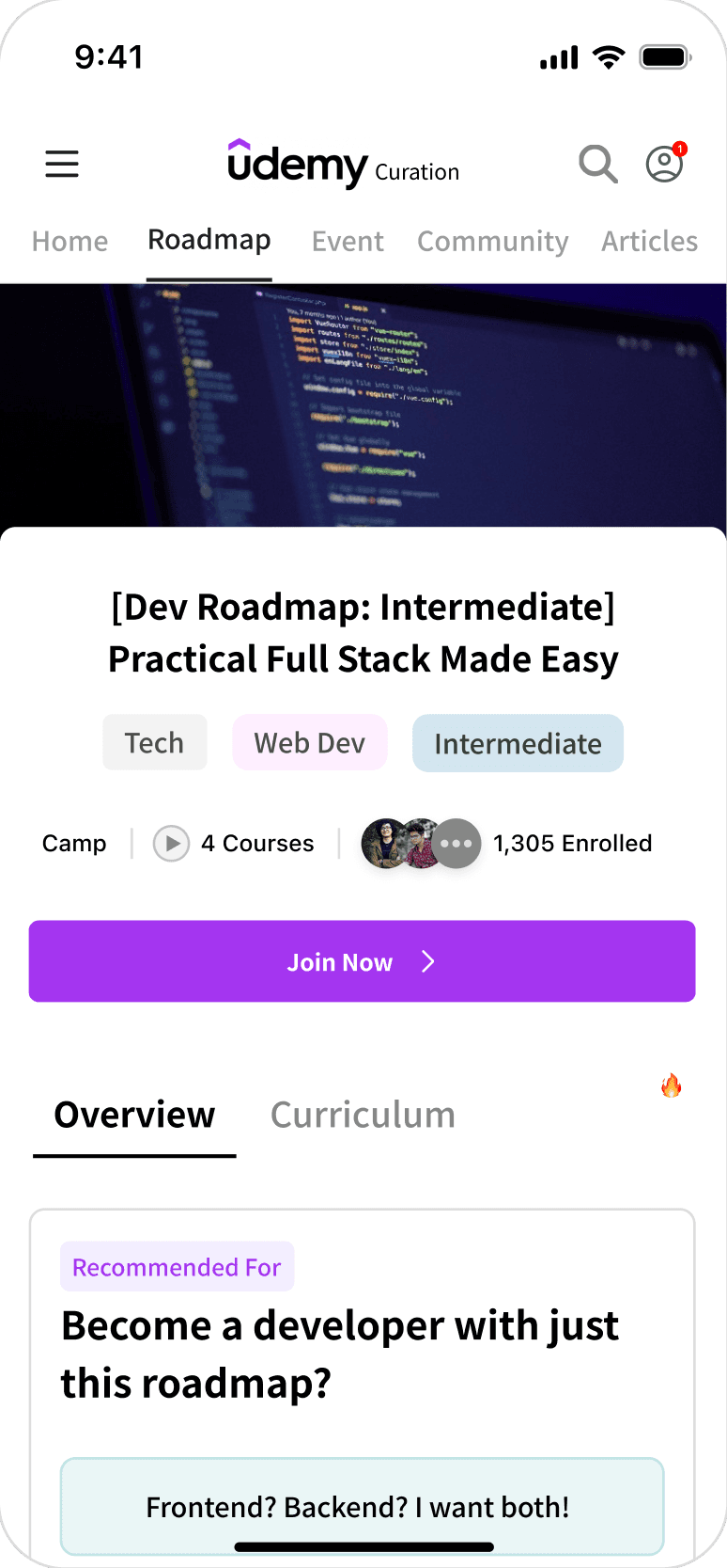
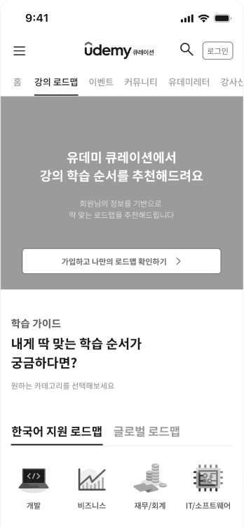
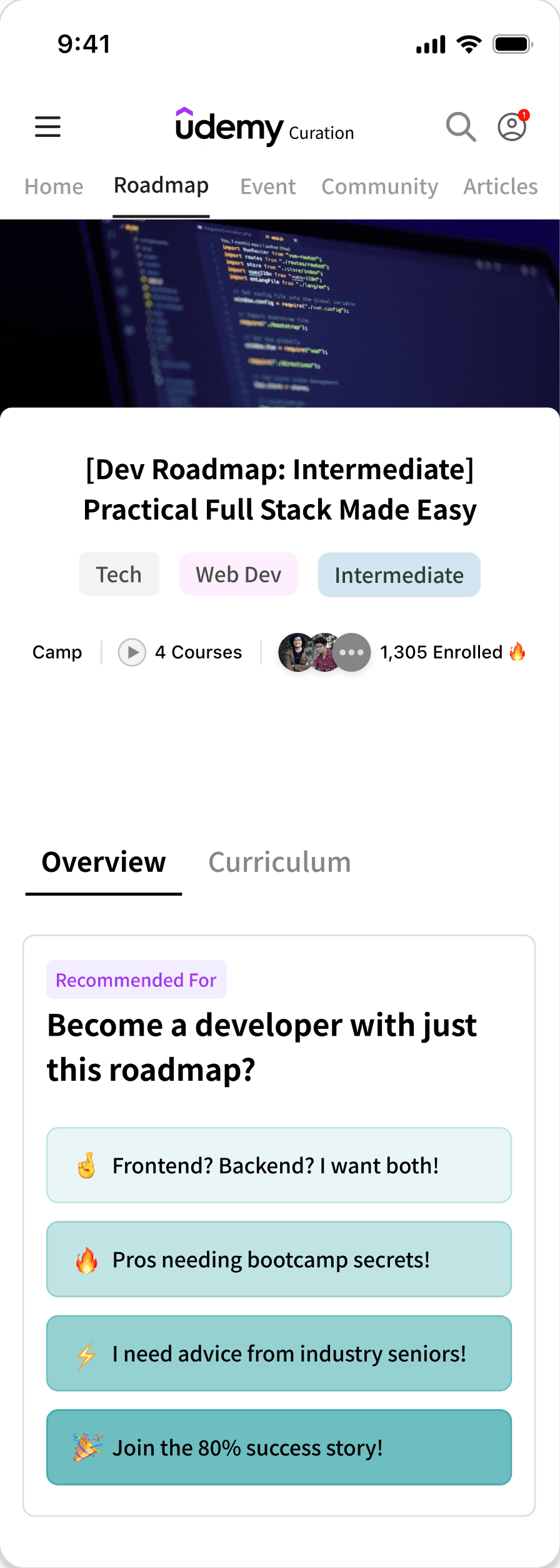
roadmap
Goal-Oriented Learning Path
Moves beyond simple recommendations by offering a step-by-step curriculum. It guides users through a logical sequence of courses to achieve specific career goals, functioning as a virtual career mentor.

Solution 03
Decision Efficiency
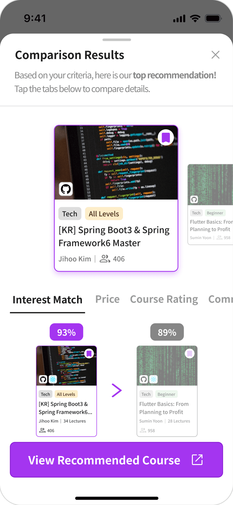
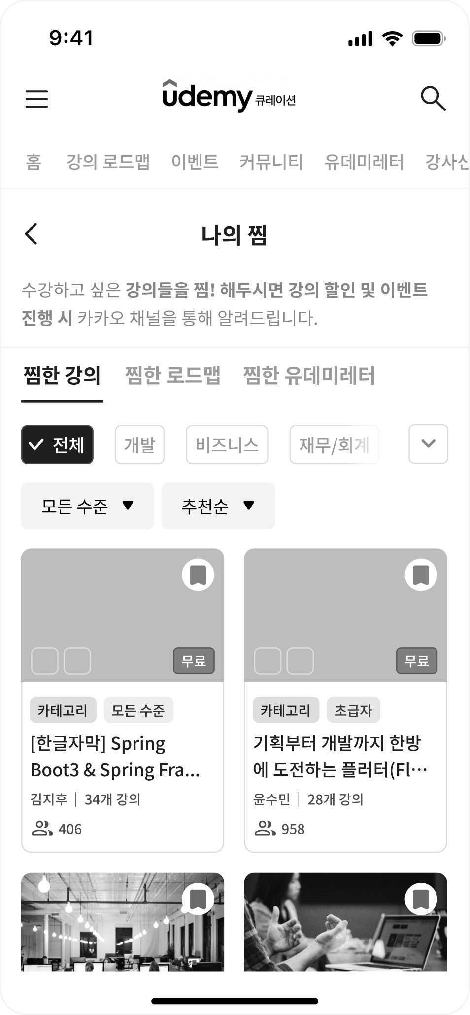
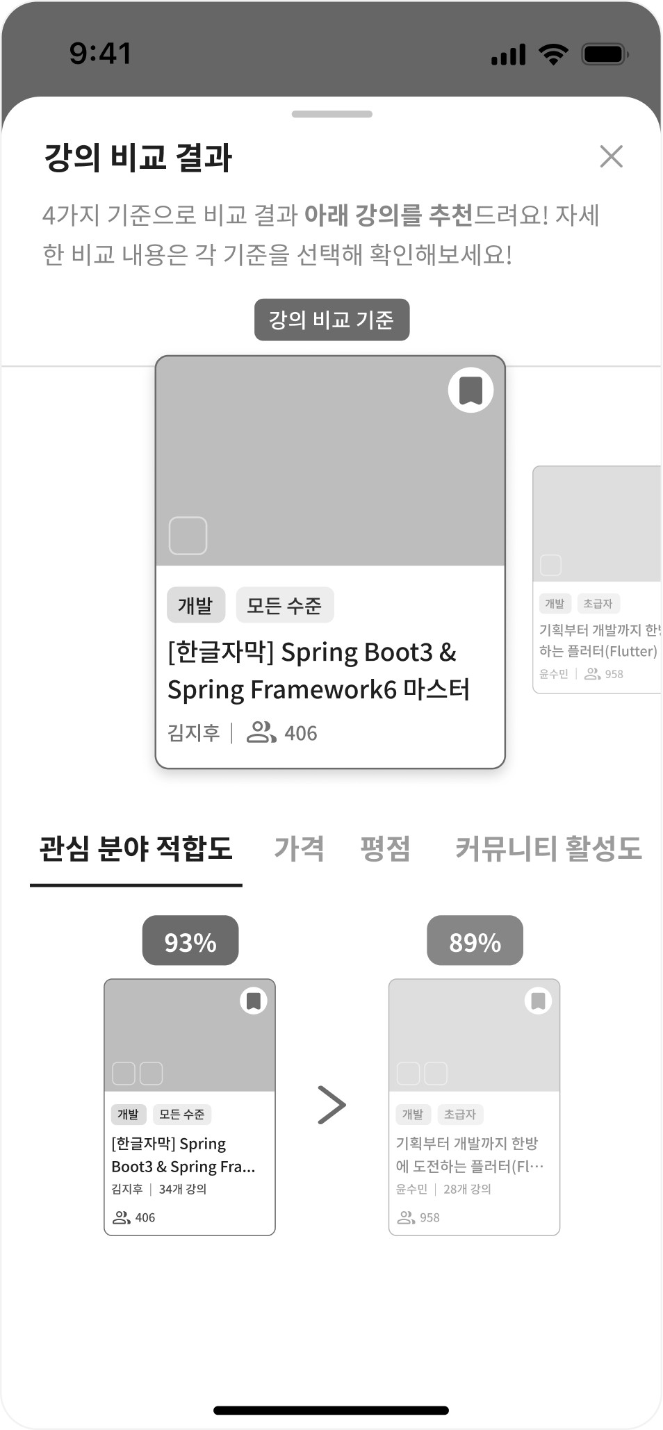
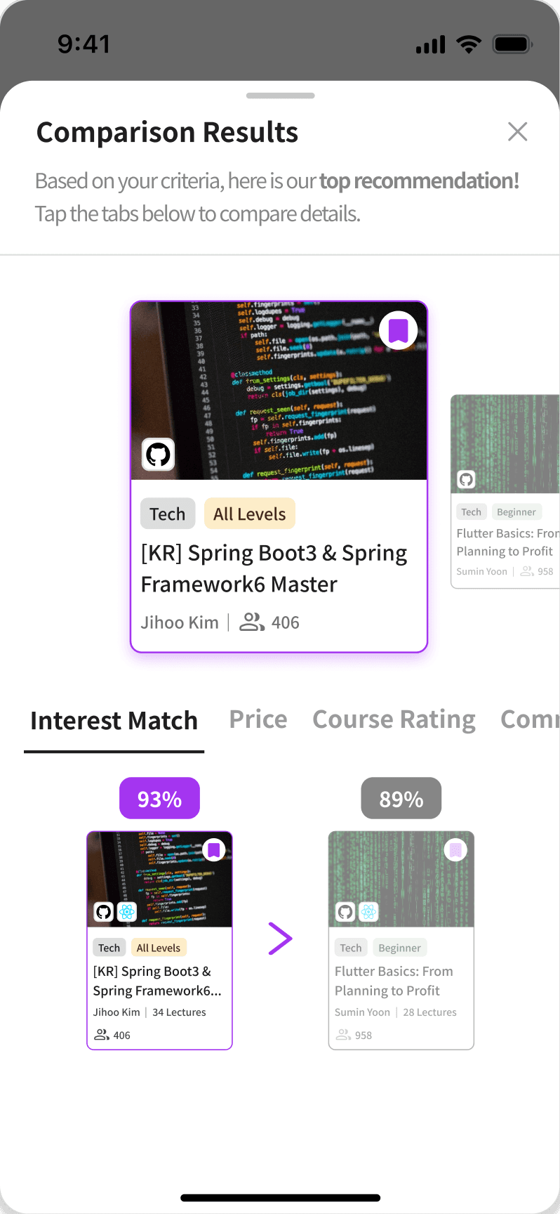
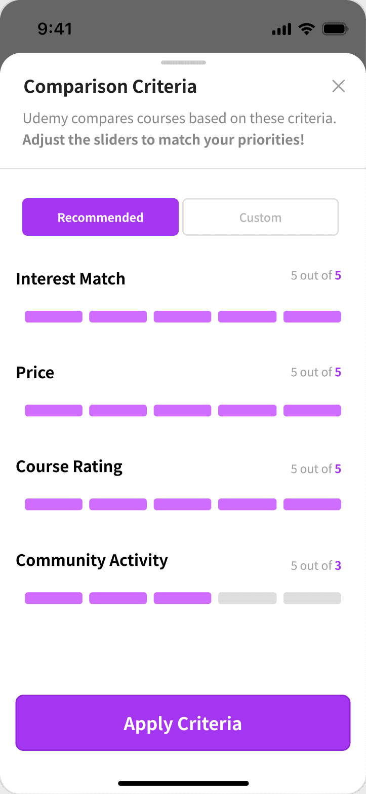
Multi-Criteria Course Comparison Empowers users to select courses with confidence through a direct comparison view. Users can evaluate lectures based on personal fit, price, and ratings at a glance, supported by a "Scroll Help" tab that allows quick navigation to essential details within long descriptions.
comparison
Smart Decision Support
Simplifies choice by comparing courses at a glance based on your personalized priority weights.
course detail
Effortless Detail Exploration
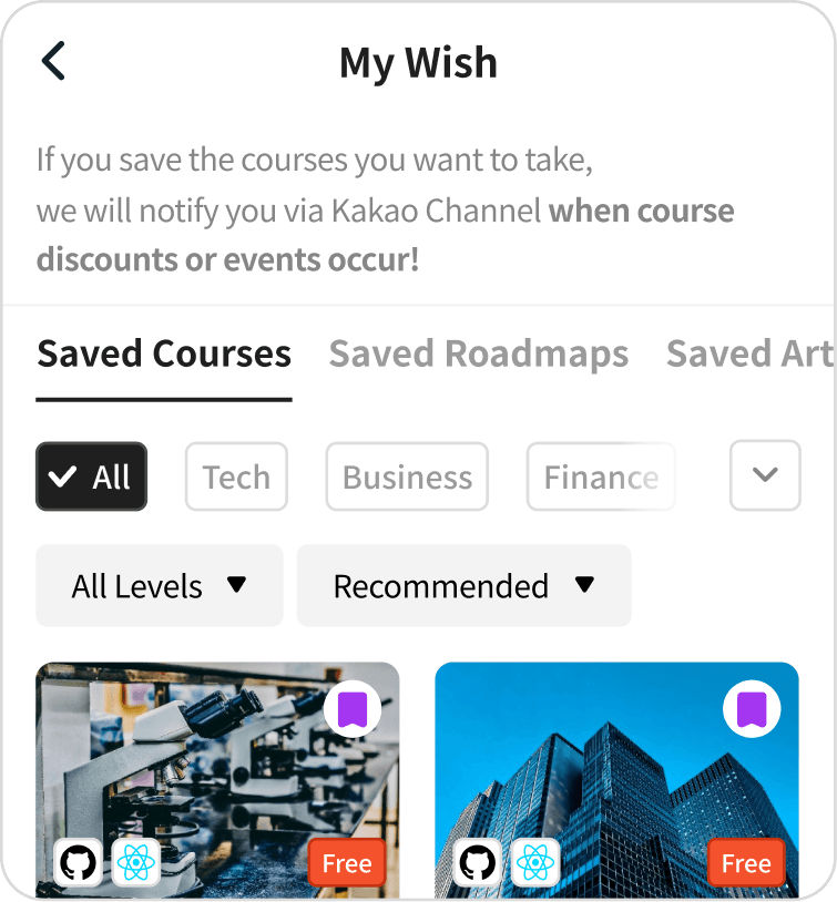
Combines floating action buttons with sticky scroll tabs, allowing users to manage wishlists and navigate extensive content without endless scrolling.
Auto-redirect to ‘My Wish’
in My Profile


Solution 04
Retention Ecosystem
Integrated Wishlist & Community Merges scattered interests—lectures, roadmaps, and newsletters—into a single "My Wish" tab for seamless management. Coupled with an accessible community interface for Q&A and reviews, this ecosystem fosters continuous engagement and sustainable learning habits.

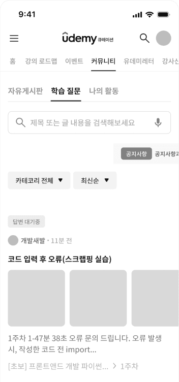
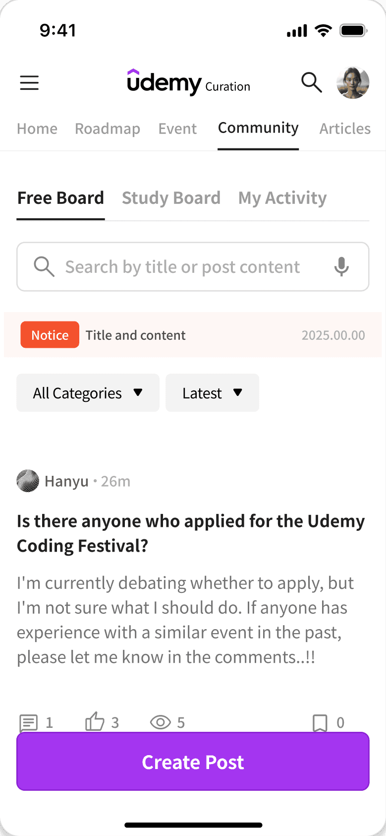
community
Active Community
& Login Trigger
Boosts engagement and sign-ups. The filter nudges users to log in for personalized course content.
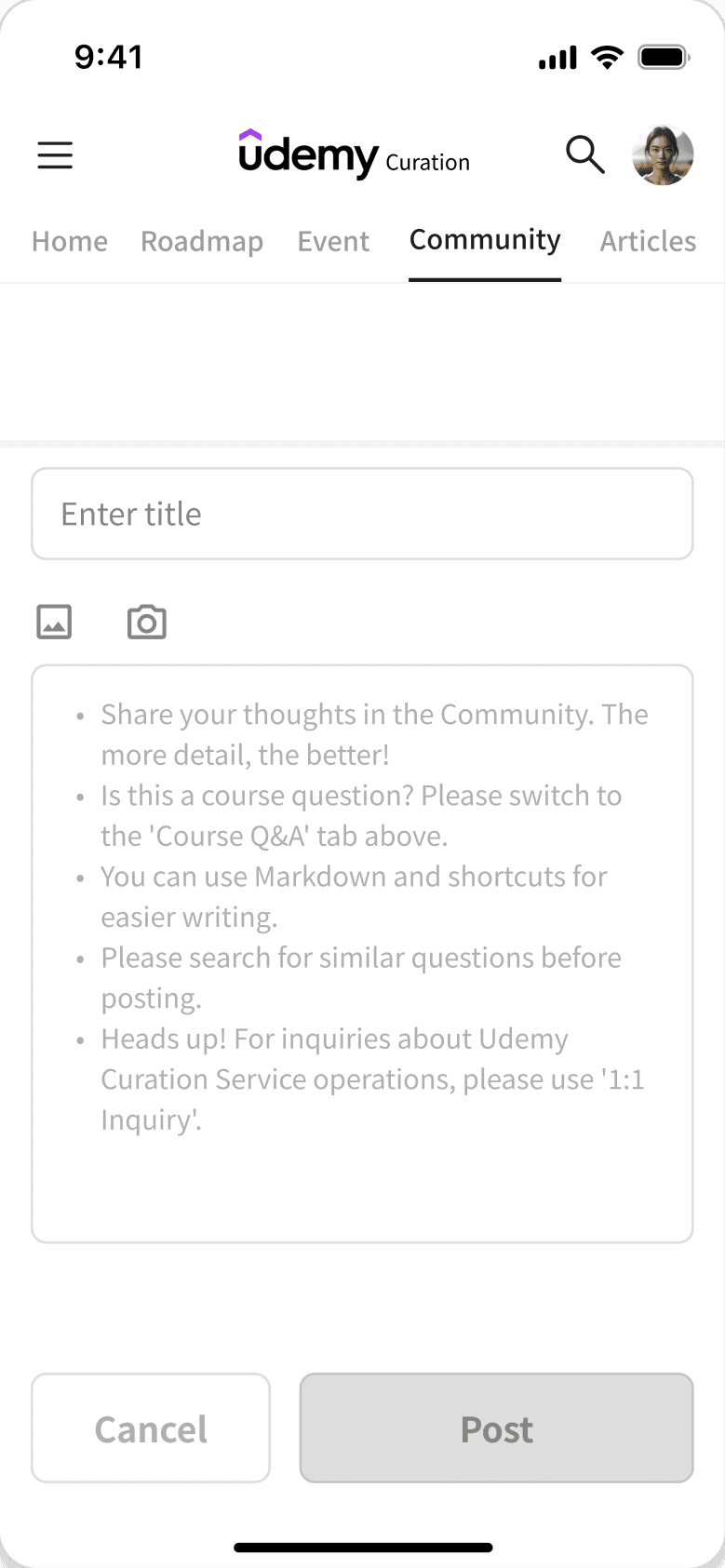
POST CREATION
Intuitive Writing Flow
Improves accessibility with a floating button. Mandatory lecture and week tags for questions clarify context and organize discussions.

design system
Body